
Product Walkthrough
A real journey through the product.
Every screenshot is the running application against real seeded Egyptian events, a real organizer account, and QR codes generated by the actual RabbitMQ + ZXing pipeline — no mockups, no placeholder cards. Captured in both themes; see dark mode.
On provenance. These were captured against the application running locally on a production build, not against the hosted deployment — the Railway backend is currently offline, so the live frontend has no data to render. Two exceptions are older captures kept deliberately: the Stripe checkout page (Stripe's own UI, unchanged by our redesign) and the two refund frames, which document a genuine Stripe test-mode refund that cannot be reproduced without a real payment.
Discover
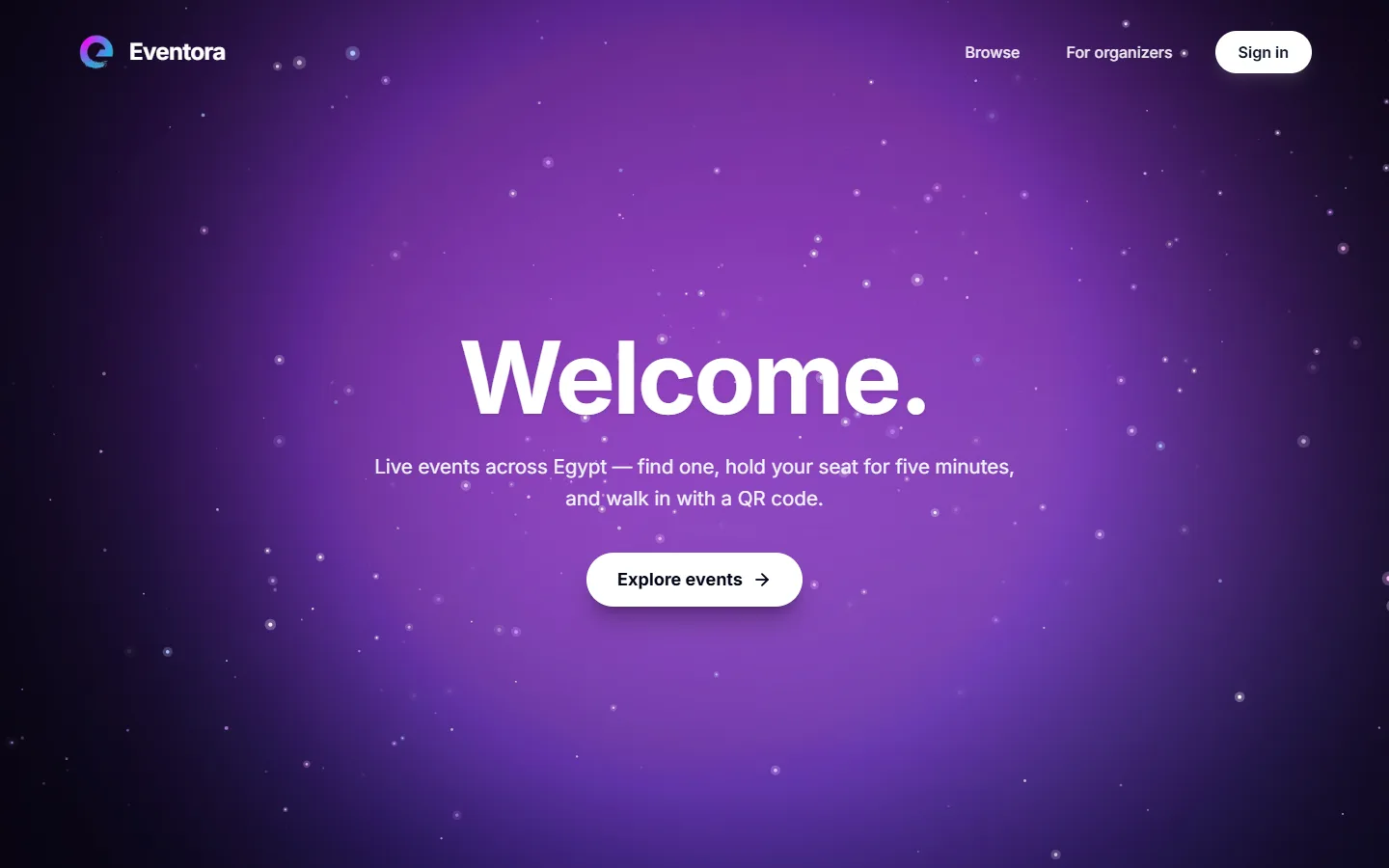
Entry scene
A standalone full-bleed entry page: morphing light fields behind a canvas particle field, pinned to exactly one viewport height.
It is deliberately fixed-dark in both themes. Every colour here is either white or scene-local, never a semantic token — so the theme swap cannot pull the ground out from under white text.
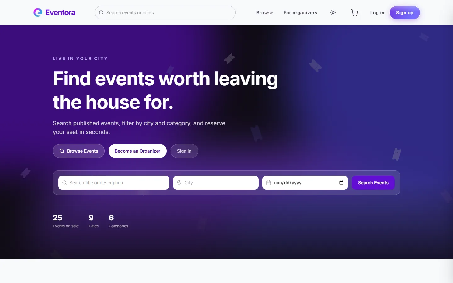
Landing page
The photo-backed hero with a functional search bar (query, city, date) and a live stat row — 25 events, 9 cities, 6 categories, counted from the database rather than typed into the markup.
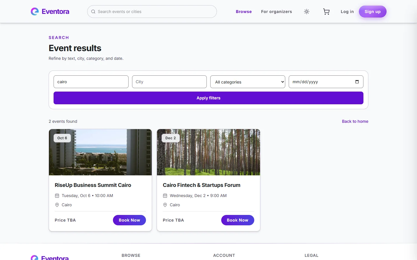
Search & filter
Filtering by category, city, text, and date against real seeded Egyptian venues and events — Cairo, Alexandria, Hurghada, Sharm El Sheikh, Dahab, and El Gouna.
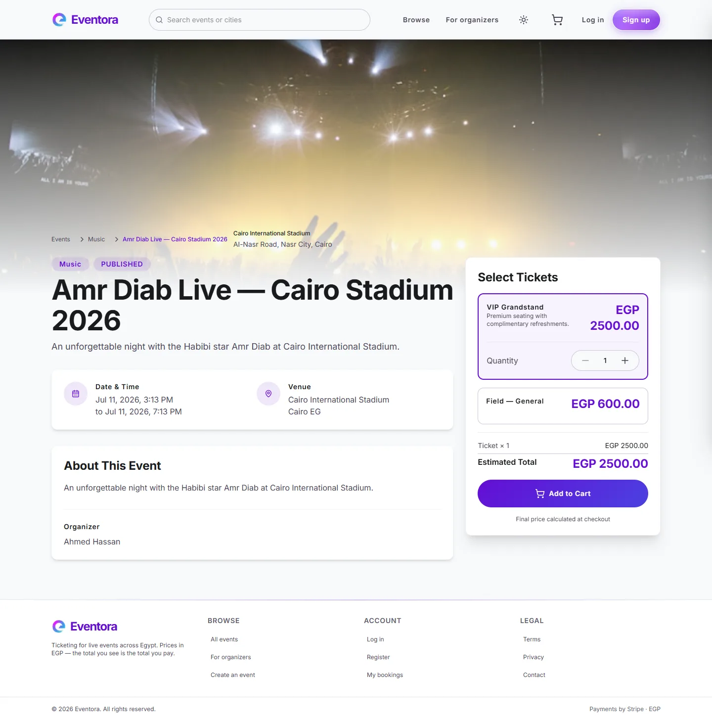
Event detail
Full venue, schedule, and organizer info, with live ticket tiers pulled straight from PostgreSQL —
availableCount decremented atomically on every reservation.
Book
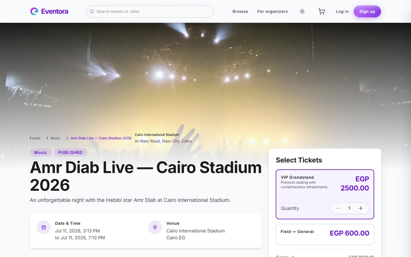
Ticket selection
Tier selection with live quantity controls and a running total, calculated client-side and re-verified server-side at reservation time.
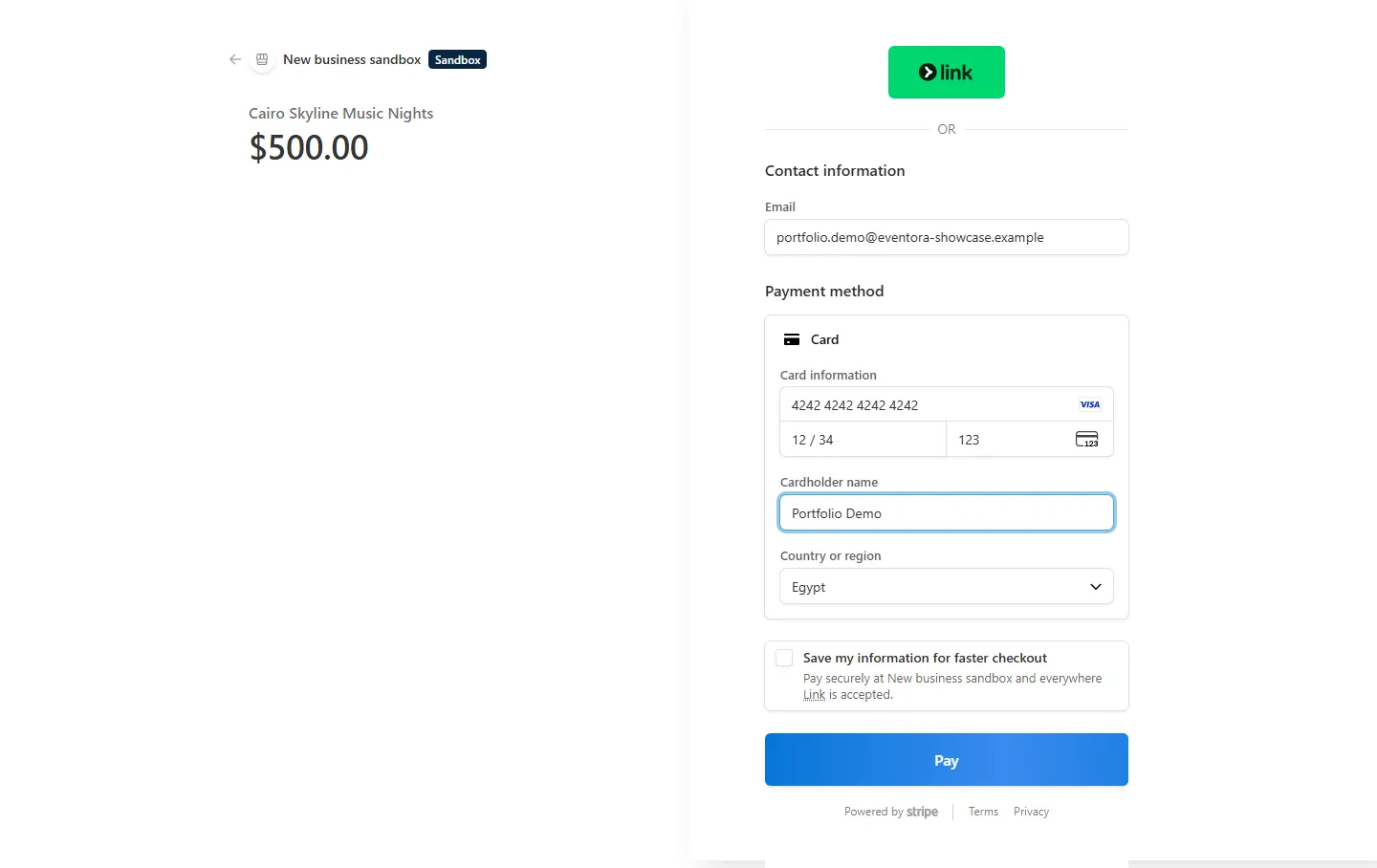
Stripe checkout (test mode)
A genuine Stripe-hosted checkout session — not a mock. Filled here with Stripe's own test card
(4242 4242 4242 4242) to prove the integration is real, end to end.
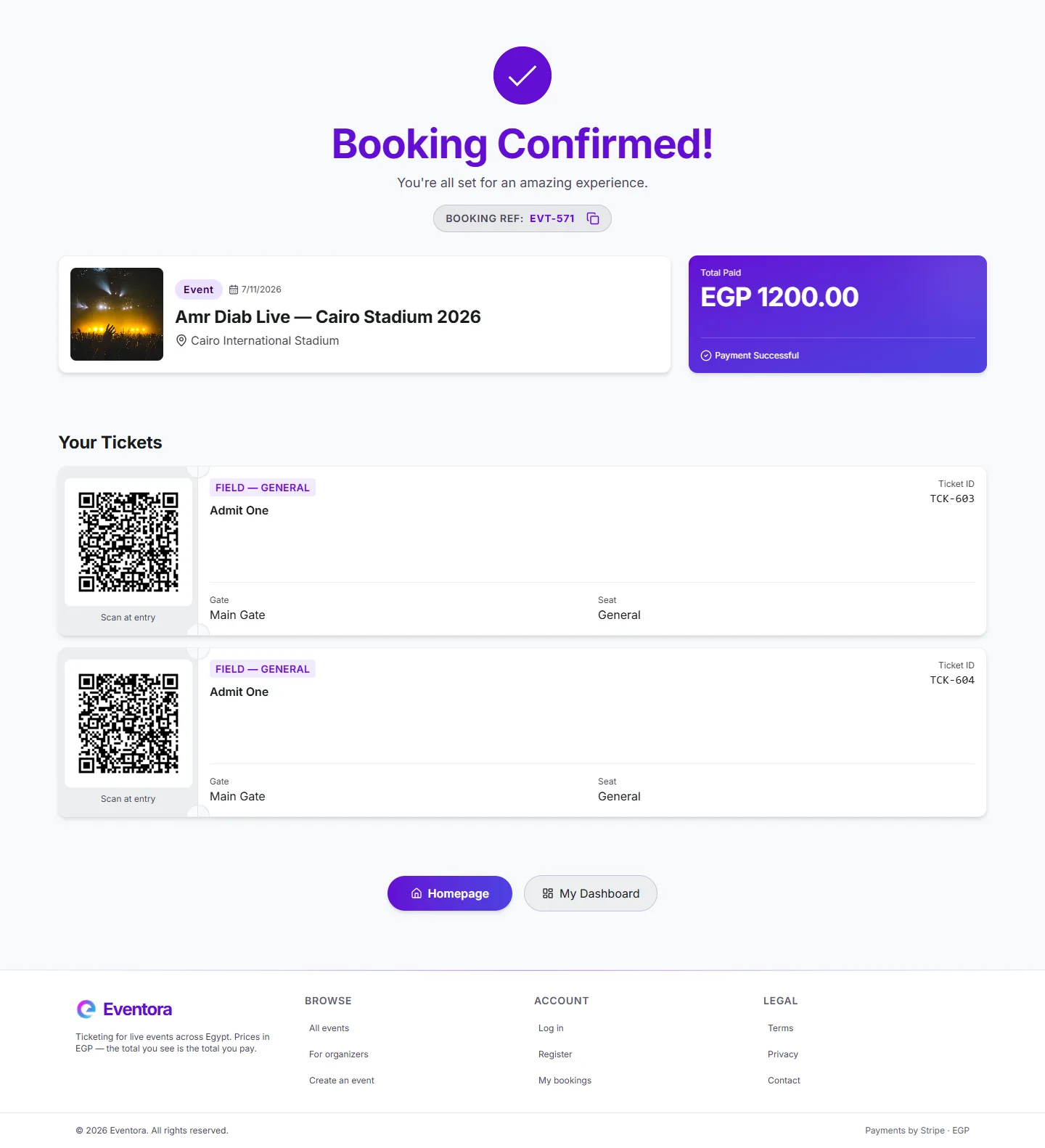
Payment confirmation
The confirmation page gates on the booking's real state rather than assuming success, and polls until the QR codes have actually been written — the ticket generation is asynchronous, so arriving here a moment early is normal and is handled rather than hidden behind a timer.
Manage
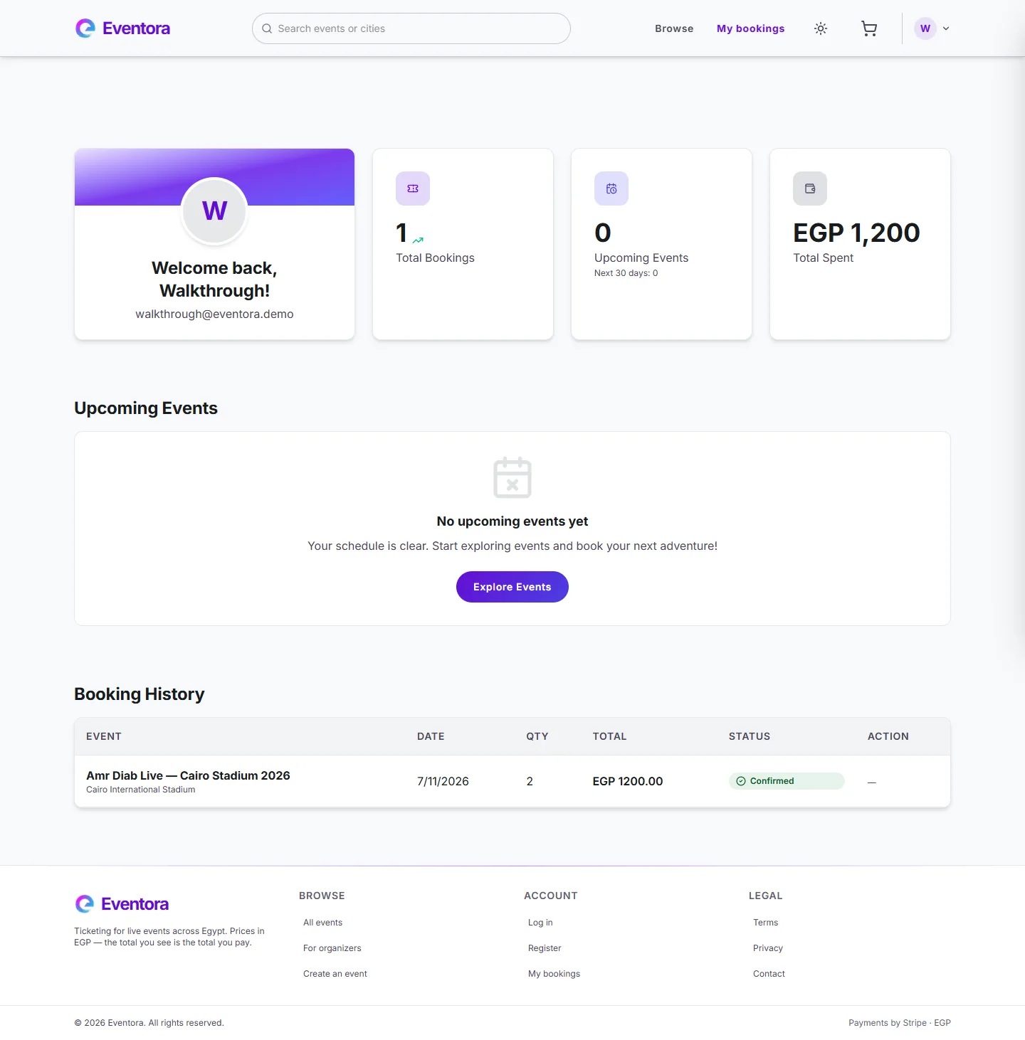
Attendee dashboard
Booking history with live countdown timers on held reservations, and one-click resume for an in-progress checkout.
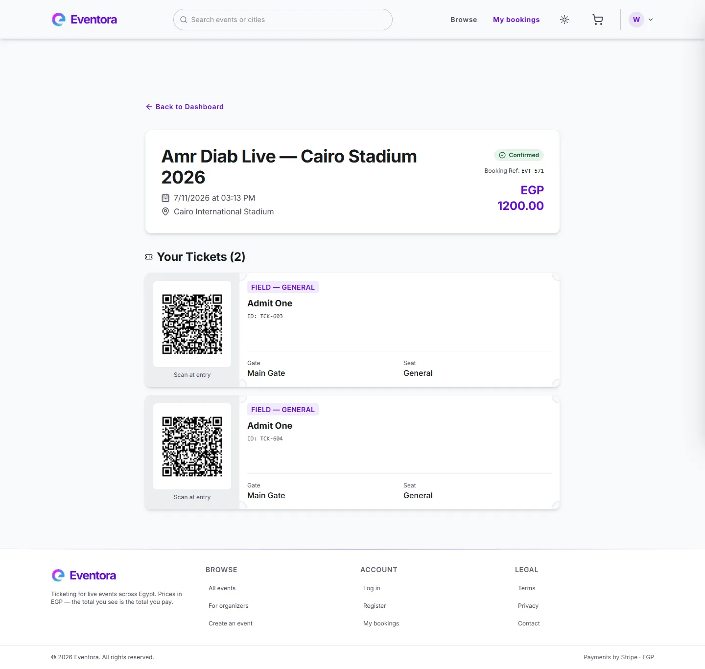
Booking detail & QR ticket
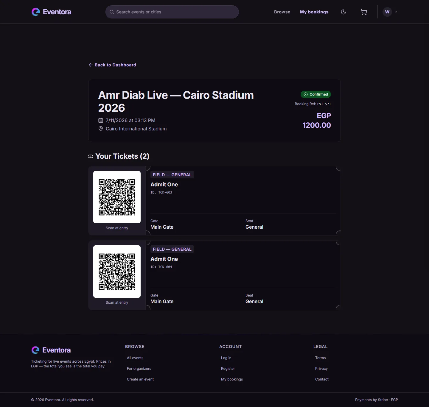
One perforated ticket stub per seat, each with its own scannable QR code. These were produced by the
real pipeline — a TicketGenerationEvent onto booking.exchange, consumed off
ticket.generation.queue, encoded by ZXing and written back as a base64 PNG.
The QR panel is deliberately white in both themes. It is not a token that forgot to flip — a phone camera at a venue door needs maximum contrast, and a dark-on-dark code scans badly.
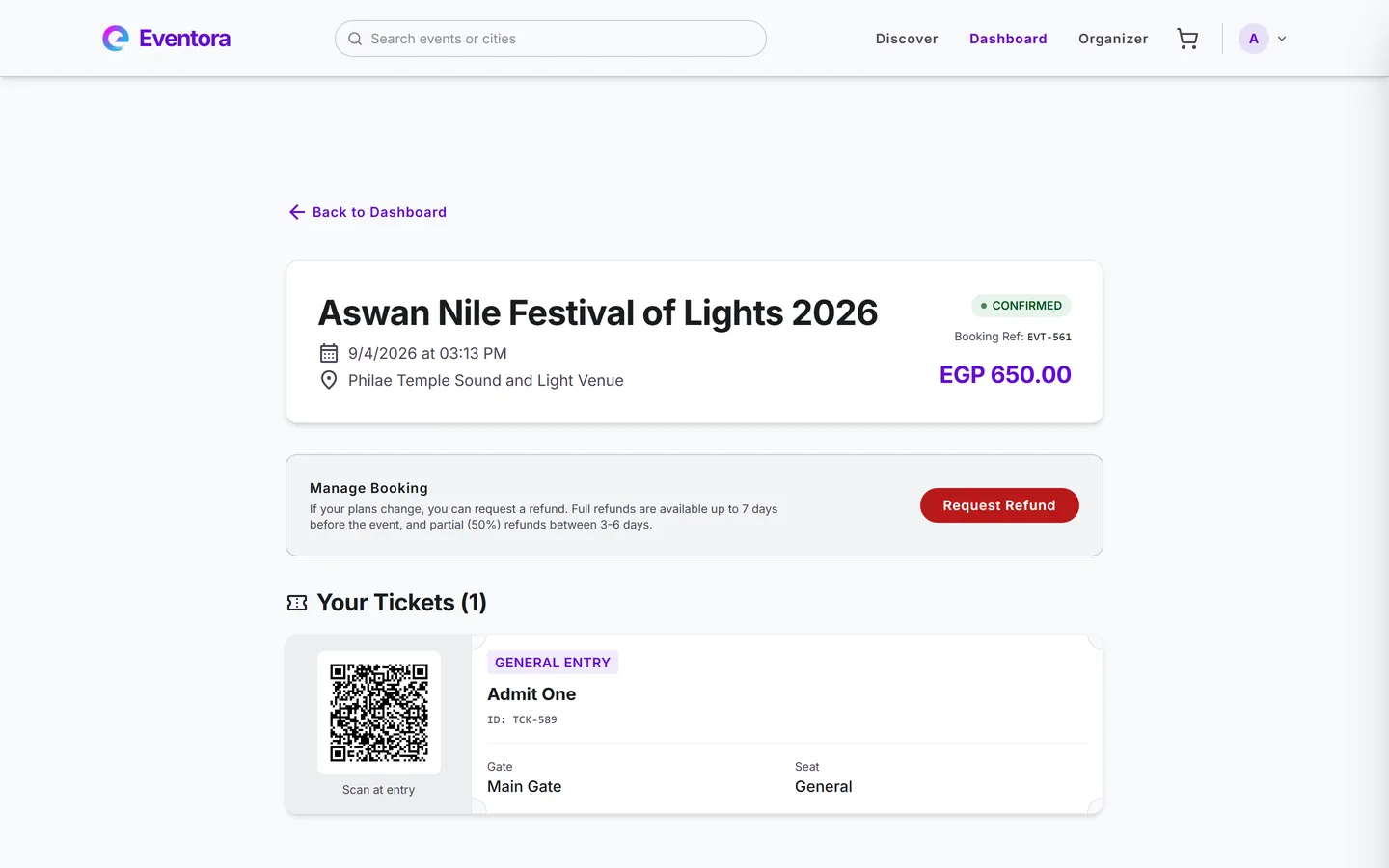
Refund request
Refunds run on a three-tier window enforced server-side: a full refund up to 7 days before the event, 50% between 3 and 6 days, and denied inside 3 days — with the denial reason stored on the booking rather than silently swallowed.
The panel only appears while the booking is still refundable, so the action is never offered when the server would reject it.
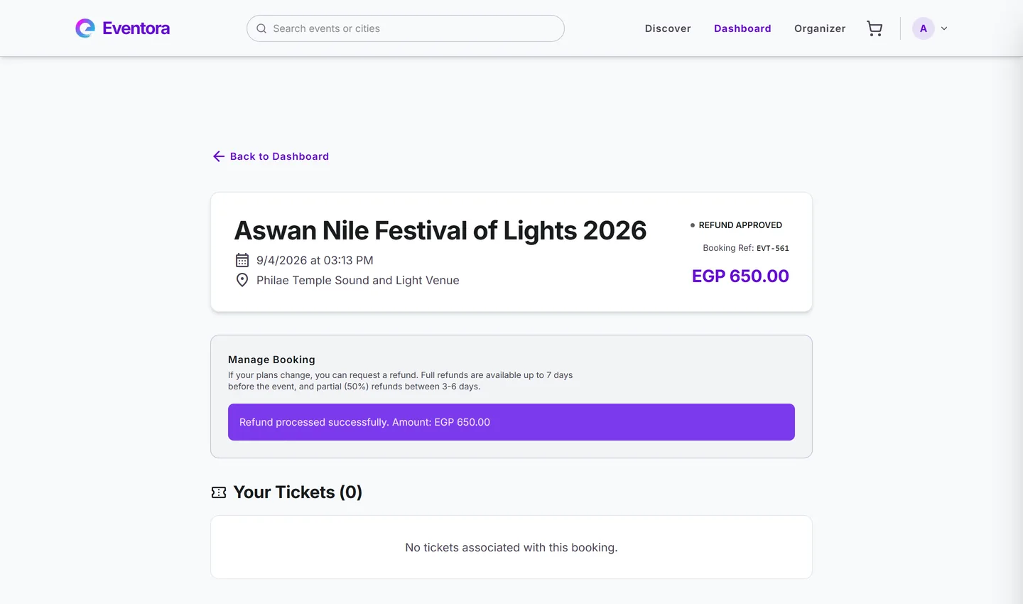
Refund approved
The same booking after the request. This event was 15 days out, so the full EGP 650.00 came back
through Stripe — refund re_3U6rVU…, status succeeded.
The booking moves to REFUND_APPROVED and its ticket is revoked, so the QR that was
here a moment ago is gone and the count reads zero. Money and access are released together, not
in two independent steps.
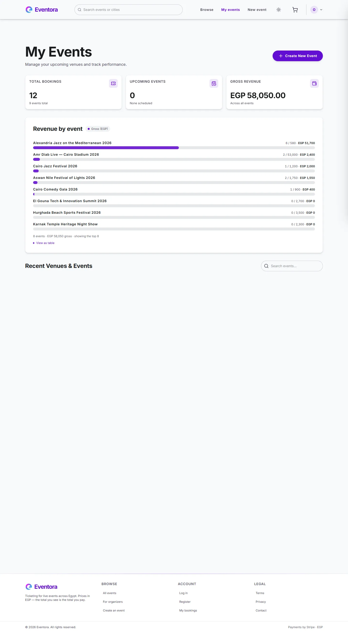
Organizer dashboard
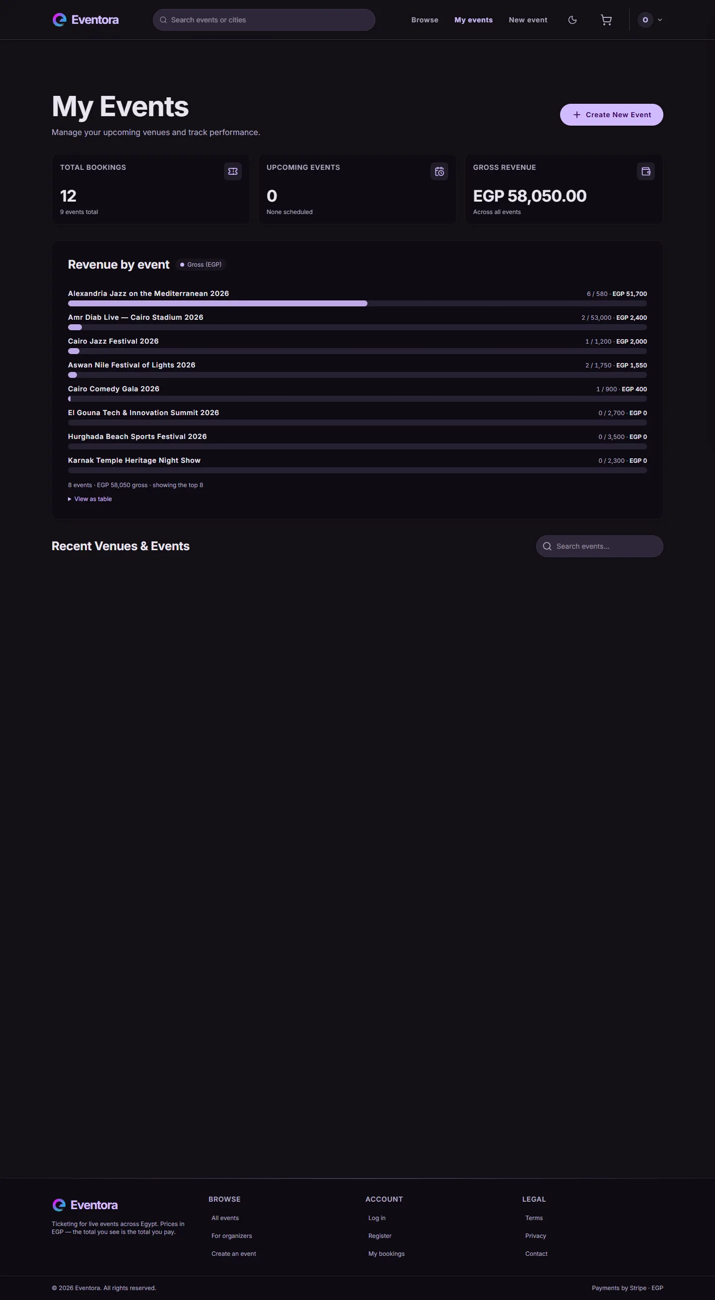
Revenue per event, sales progress, and quick actions, logged in as a real organizer account.
The chart draws one bar per event from actual grossRevenue. Its predecessor spread real
totals across thirty invented daily buckets and labelled them as real per-day figures; it was replaced
rather than restyled, and the total is verified against SELECT sum(total_amount).
Attendee check-in
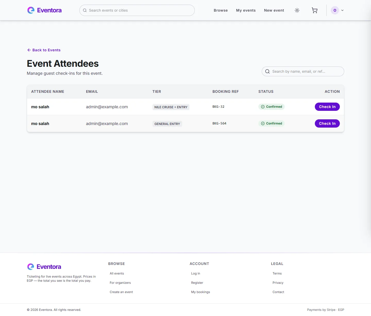
The organizer-side attendee list, searchable by name, email, or booking reference — this is where day-of check-in happens.
Dark mode
Dark mode is not a second stylesheet. Colour is defined in three
layers — primitive, semantic, component — and Tailwind's --color-* namespace is mapped onto
the semantic layer with @theme inline. Because inline compiles each utility to
var(--sem-…) rather than freezing a value, the entire theme is one block reassigning
that middle layer. No utility, component token, or line of markup changes.
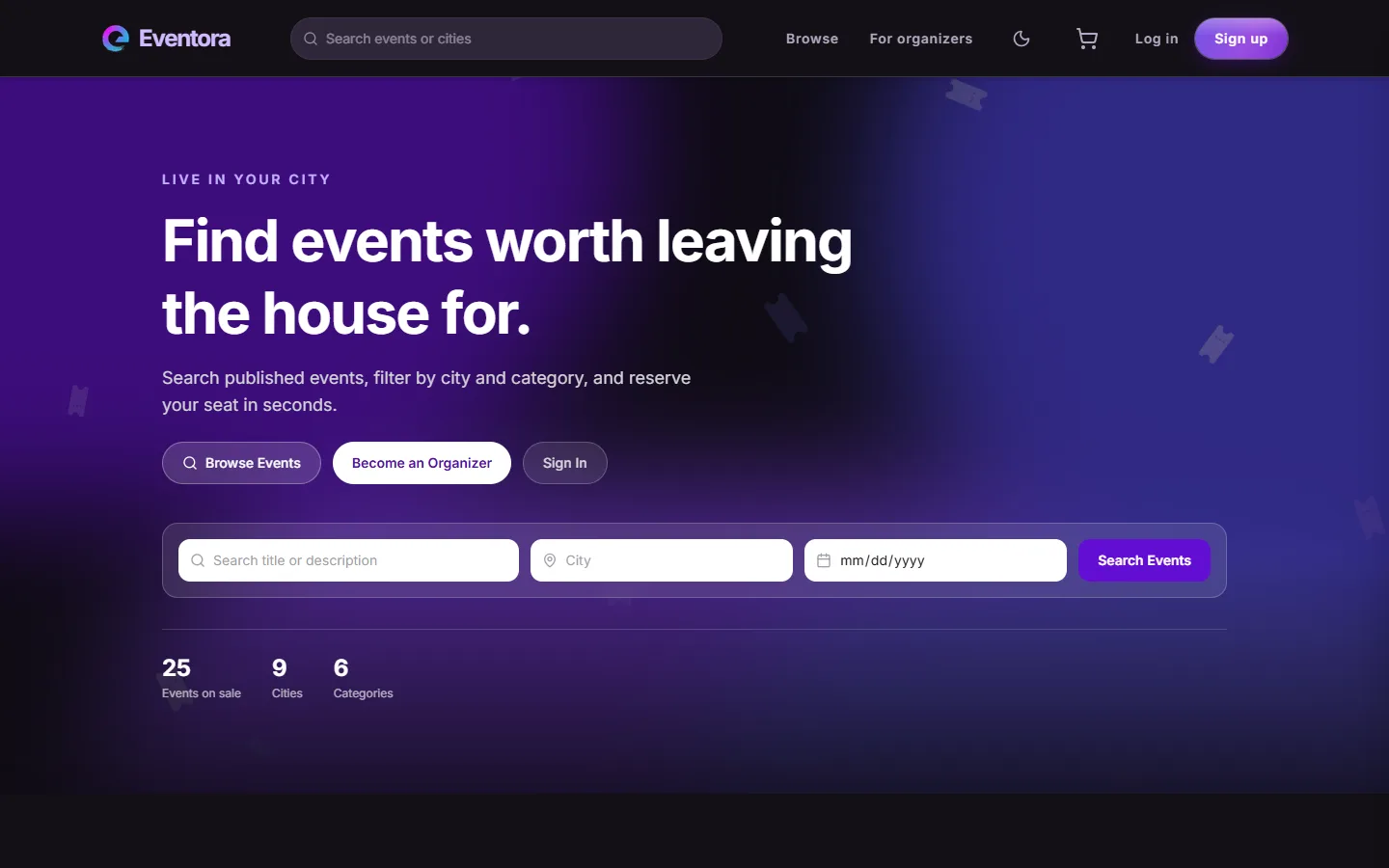
The same markup, reassigned
Every surface, border, and text colour here resolves through the same variables the light theme
uses. The theme is stamped onto <html> by a small script in <head>
that runs before first paint — anything deferred until after hydration flashes the wrong
theme on load.
The preference persists, and defaults to the operating system's
prefers-color-scheme when unset.
What deliberately does not flip
Two things hold their colour across themes on purpose. The QR panel stays white so a phone camera keeps maximum contrast at the door. And the ten booking status chips use Material 3's fixed roles, so "Confirmed" green means the same thing in both themes rather than drifting to a different hue.
Getting this wrong is easy and quiet: three controls were found whose background flipped with the
theme while their label did not, one landing at 1.71:1 — invisible text. The audit that
caught them initially missed all three, because it read background-color and those
controls are painted with a gradient, which is a background-image.
Charts follow the tokens too
The chart's colours are read from the same CSS custom properties as the rest of the page rather than hardcoded into the SVG, so it re-themes with everything else.
All 41 semantic token pairs were measured on the built output in both themes. The lowest contrast ratio in dark is 6.13:1 — above the 4.5:1 AA threshold for body text with margin to spare.
Responsive
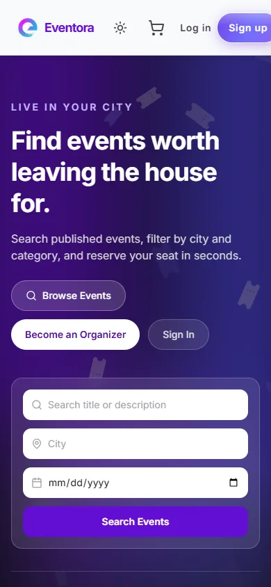
Mobile layout
The same landing page at a 390px mobile viewport — single-column stack, full-width cards, no horizontal scroll.